Logo with the word 'moma' in stylized red lines and 'ART & DESIGN' written below.

560 Johnson St #304, Victoria, BC.

Bold, stylized text reading 'HAPPY HOLIDAYS' with a black background and white lettering.
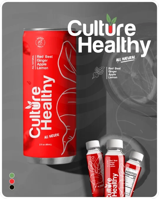
Logo with the words 'Culture Healthy' and a beaker with a plant inside
Large white text spelling 'ANCHOR' on a black background.
Empty beige background with no objects or details.
An emergency medical symbol with eight arrows pointing outward in a starburst pattern, centered on a black background.
Stylized text reading "The Hood 2.0" with an arrow pointing to the right.
The emblem of the United Nations, featuring a world map surrounded by olive branches.
Black and white logo of the KIMANYA-NGEYO foundation for science and education, featuring a spiral shell graphic on the left and the foundation's name and purpose on the right.
Black and white logo for Toolpath Design featuring a drill bit forming the letter T inside a hexagon shape, with the text 'Toolpath Design' below.
Logo of Nathan MacLeod Real Estate Agent with geometric shapes and text.
Circle logo with cartoon dog and puppy in the center. Text around the circle reads "Howl About A Way From Home" and "Dog Boarding & Daycare."
Line art illustration of Saint John with a lighthouse, tree, and sailboat, with the text Saint John at the bottom.

SELECTED WORKS

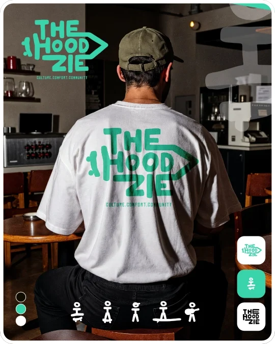
Vertical black banner with white text and graphics. The top and bottom have the phrase 'THE HOOD ZIE' with a stylized arrow pointing right in between. In the middle, there is a small, simple stick figure illustration of a person.
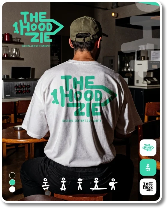
Graphic text logo reading 'The Hood Zie' with a right arrow, and smaller text below saying 'culture.comfort.community'.
Black and white cartoon illustrations of children skateboarding, riding a scooter, and playing baseball.
MONS developed the full brand identity and visual language for The Hoodzie. The project included designing a bold, energetic logo and a cohesive visual system adaptable across apparel, packaging, and digital platforms.

INDUSTRY

Clothing

SERVICES

Brand Design
Visual Identity
Vertical traffic light showing red at the top, yellow in the middle, and green at the bottom.

Our seasoned professionals demonstrate mastery across disciplines.

Since our inception, we have advanced organizations across sectors by pairing strategic insight with disciplined execution.Our multidisciplinary team analyzes each objective, designs a tailored roadmap, and implements with rigorous oversight.

Vertical black banner with white text and graphics. The top and bottom have the phrase 'THE HOOD ZIE' with a stylized arrow pointing right in between. In the middle, there is a small, simple stick figure illustration of a person.
Graphic text logo reading 'The Hood Zie' with a right arrow, and smaller text below saying 'culture.comfort.community'.
Black and white cartoon illustrations of children skateboarding, riding a scooter, and playing baseball.
MONS developed the full brand identity and visual language for The Hoodzie. The project included designing a bold, energetic logo and a cohesive visual system adaptable across apparel, packaging, and digital platforms.

INDUSTRY

Clothing

SERVICES

Brand Design
Visual Identity
Vertical traffic light showing red at the top, yellow in the middle, and green at the bottom.

CULTURE HEALTHY.

It all begins with an idea. Maybe you want to launch a business. Maybe you want to turn a hobby into something more. Or maybe you have a creative project to share with the world. Whatever it is, the way you tell your story online can make all the difference.
Three vertically aligned circles: green at the top, red in the middle, black at the bottom.
Logo for Culture Healthy with a radish illustration replacing the 'u' in 'Culture' and the words 'All Natural' written underneath. Ingredients listed include red beet, ginger, apple, and lemon.
For Culture Healthy, we developed brand identity, visual identity, and packaging mockups. The logo merges clean, rounded typography with a subtle organic touch — the leaf sprouting from the letter U symbolizes growth and vitality.
The overall look aims to stand out through minimalism, strong color, and a cohesive system adaptable for future flavor lines.

INDUSTRY

Food

SERVICES

Brand Design
Visual Identity
Packaging

Recent Client

Smart Warehouse Retrofit
The comprehensive retrofit reduced manual handling by forty percent, optimized energy consumption, and provided executives with real-time performance dashboards.

Dallas, TX
March 2024